A year ago I started using OS X, and gave a bunch of thoughts on the experience. A year later, I’m using it exclusively. I’m sure you could pull up any number of UI mistakes in OS X – there are many. Perhaps I’ve adjusted or gotten used to them. When I need Windows, I usually fire up VMware and run XP.
A few days ago I installed Windows 7 on a spare computer. The experience was horrifying. It was like putting my head in a clamp that has complimentary electroshock therapy. What surprises me most is that I used to be a die-hard Windows fanboy. I’d have nasty arguments with mac users. I’d love touting MSDN and the WinAPI. I can’t even try to muster up this enthusiasm anymore. The Windows 7 (and Vista) UI drains my soul.
The Windows 7 installer kept freezing at two points in the process – before copying or disk formatting or anything! I waited about ten minutes before rebooting. Rinse, lather repeat. Finally someone told me I had to just wait it out, despite there being no I/O activity or visual feedback. Sure enough, after about 15-20 minutes of waiting it proceeded.
After starting up, the Aero UI was… ugly. Everything looked about a dozen pixels too thick. The glass effect looked like my UI had beer goggles, made worse by the way-too-bright default blue. So I turned border padding really low, turned off transparency, and made the border colors as solid as they could get.
Delays in responsiveness make the UI seem slow or broken, or like my computer isn’t fast enough. What baffles me is why Windows has arbitrary delays in the UI. Two examples.
The Start Menu has this right-hand pane that lists things like “Documents”, “Downloads”, “Computer”, etc. As you hover over these, a respective icon fades into view. But there’s a very noticeable delay… it feels around just under a full a second, until the fade-in begins. So your mouse can sit on the “Control Panel” text but still have the icon for “Run”.
Minimizing and maximizing windows also has noticeable delay. There’s some kind of animation, but it’s much slower than OS X. It’s distracting and slows down workflow. I went to “Advanced Performance Settings” which requires administrative access. I knew that changing the animations is a setting that reverts after reboot, but I gave it a shot. I unchecked the feature, clicked OK – and suddenly all my UI settings reverted. I was back to hideous blue, transparent Aero. Ugh. So I fixed my UI prefs again.
Next, I installed a secondary drive to copy old files. The drive showed up as “E:”, so I navigated to “E:\Users\dvander”. It asked for Administrative credentials. I typed in my password, and hit okay… but nothing happened. No response, but the drive started churning furiously. I tried again, but nothing happened. Now I was getting worried – I knew the drive had bad sectors. Was it finding more? Was it creating more? What was all this activity? Why couldn’t I access my folder?
I launched Explorer as an Administrator, but no luck. It still asked me for admin credentials, and still did nothing. I launched cmd.exe, and navigated to “C:\Users\dvander”. Surprise! I could read it fine from there. So what was going on with Explorer?
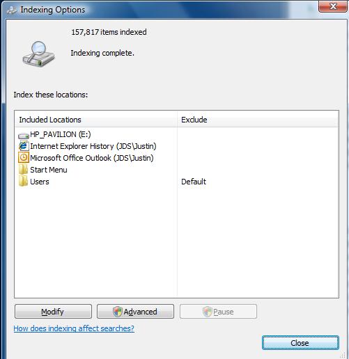
Then I noticed the path bar in Explorer was slowly filling up with green stuff. Was it Indexing? I Googled “disable indexing” and found this site. I still don’t understand the UI here. Try it out. There’s some sort of two-pane list of mutually exclusive terms, but a selection carries across both. You can select something and hit “Modify” but it seems like the “Modify” box has nothing to do with what you selected. I’m sure this is way more flexible than Apple’s Spotlight, if I could only understand it. It looks something like this (image from article):

I took a guess that “Users” was indexing everything in E:\Users, so I removed that and hit OK. Instantly, all that churning stopped, and Explorer brought up my folder!
Explorer was blocking the entire user interface on an automatic, massive, recursive indexing operation over all my files. The only feedback was an authentication dialog for something I had access to, that silently failed anyway.
With that solved, I started actually using things. The taskbar was too big, older Windows apps have icons that don’t scale properly. Hell, most actual Microsoft apps don’t. So I made it smaller, only to find that the circular “Start” button clips into the working area of a window. This did not happen on Vista. So I made the taskbar auto-hide (which still leaves a tiny sliver about 1-2 pixels thick).

Okay… I’ve been ranting a while now. Two more things. What’s with Windows 7 file dialogs?

When this thing pops up, the first thing I do is mouse wheel to get to the file I want. Oh, sorry, I meant I used to do that. In Windows 7, when this dialog appears, the mouse wheel does absolutely nothing. First you have to click inside the file list. Great, extra movement. This might even be a regression but I forget what XP did. Of all the Windows 7 idiosyncrasies, this one hits me the most frequently, and it’s really bothersome.
Finally, what’s with “Program Files (x86)” versus “Program Files”? As if spaces were bad enough in such an important path (thank God “Documents and Settings” is gone), now we have parenthesis? Why is there even a difference in the first place? It seems like some x64 stuff goes into the x86 folder, and vice versa, so what’s the point? Why isn’t this called “Programs”?
Phew. If only OS X could run Valve games.


